
Graphic Design

1.
How much experience have you had using Photoshop before this course?
From now (15/09/15) I have a very basic understanding of Photoshop and can use it to a very basic level.
2. List as many examples as you can think of where Photoshop is used in the creative media industries.
*Posters
*Thumb nails on videos
*Video game covers
*Magazines
*Any marketing
3. What is the average salary of a graphic designer in the UK?
Between £40,000-£60,000

I made this image to help advance my skills in Photoshop. So I now have a better understand of basic Photoshop and will be moving on to more advance Photoshop in the future.

This image shows me using my basic knowledge of Photoshop by putting everything i have learnt into one image. This also shows that i can now advance onto a higher understanding of Photoshop and for me to go on and advance with Photoshop.


Today I was putting my basic Photoshop skills to the test by doing mood boards. The first mood board I was doing was more of a tester one to see how It would work. For example on the first one I did (The one on the left) I mainly focused on text. Where as the second mood board I did (the one on the right) I used more images and it came out as more effective. For example the one on the right is effective because it tells a better scope of what the game is going to look like. For example on the right you can see I wanted the game to be about speed and about the game to be more futuristic because of the futuristic car in the middle. The left one is effective because the text also tells us straight what we are aiming for, but its not effective or as attractive as images.
Analyzing typography

The typography used in this tittle is very instresting because its very unique in a way. For example the appearance of the logo is good because the sharp edges could indicate that this is not going to be a friendly adventure there going on. Also the glow could mean that good will always win and that in this story there will be hope at the end of the day. Another typography that this title logo does good is the themes, you can tell that its talking about a certain character and it starts to show certain bits of context in the image, which helps to sell the movie that it is marketing to.
If we move onto audience we can tell straight away that this is not for kids (I mean that its not a U rating), but also you can tell that's its not an adult movie (I mean that its not a 15-18 rating). So this is obviously a PG-12 rating because from the title you can tell there are going to be dark themes in there, but at the same time it could be a film about someone trying to turn those dark things into something wonderful and happy.
Lastly, if you look at this with a certain perspective (for example someone who has never watched 'Harry Potter' before) you would think that this was not for kids and all the things I have pointed out would be different because they would have a certain point of view on it, which you will not see because you would have known the themes and known the characters.
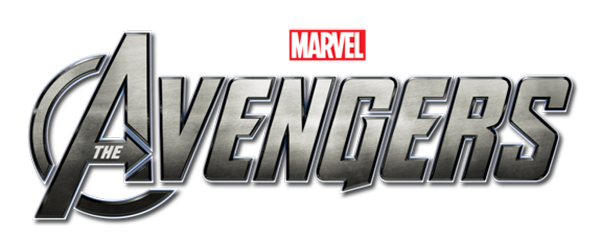
The typography used in this movie title is very different from the 'Harry Potter' one because where as the 'Harry Potter' one is fantasy, 'The Avengers' one is sci-fi so they are going to be different because they are two very different genre's. So firstly the title's appearance is very robotic and its quit bold and out there, which makes it quit eye catching for someone to see if its on a poster or something. Also the themes of 'The Avengers' from this title is that its about this team of superheroes (you can tell its about superheroes from the 'Marvel' logo) who go out and save people. So its an action movie for kids. So the audience is mainly 12 because its a live action superhero film.
If we talk about audience for a minute, so we know that the audience is mainly going to be 12 and up because from the themes being a live action, sci-fi film about superheroes. So they have there target audience and they will be selling it to that target audience and they did that in this title by making the typography very family friendly and by smoothing down the edges so there not sharp like 'Harry Potters' was. So you can see how a graphic designer thinks when designing a logo or a title.
Lastly, if we finish this section off with looking at it wit a certain view again you can see that say someone off the streets who has never known about marvel, never known about comics, hasn't researched anything about the film and just looked the title they wouldn't be so impressed because yes the title sells the film also, but its a joint effort with the images complementing the title. So a title on its own can't sell a movie poster.

The typographic used in the movie title is a lot different then both of these because its being used in a game instead of a movie. Now a movie title is trying to sell a movie to people where they need to know certain aspects of it. Where as a game only has to sell the fun aspect to people. That's why comparing two movies (to different genre movies) to a fun kiddy game is quit important to understand how they are different. So as we have done with the other titles we need to know what the appetences looks like. The appearance for 'Minecraft' is quit basic in design, but that is a good thing because it reflexes the graphics in the game. The rock layers tell me that this is going to be a mining game as in the title 'MINEcraft' this shows that the term is an acronym and actually shows us an example of what the game is going to be based around.
The audience for this game is pg and I can tell that because its very cartoony, but I think you need the parents guidance because in the 'A' you have a creepers face and the face looks quit evil, where as 'U' has not evil looking bad guys.
Lastly, if we take someone who has never played this game and knows nothing about 'Minecraft' you can see that they would be quit creepied out because its quit a dark color palate. And without the images to tell that this is a kids game they wont buy it because they will think its inappropriate.

Now what I did here was showing my skills in how video game professionals think and do video game titles. For example when i was making these video game titles there was tones of experiments on what looked good and what didn't. So that's what a lot of this was about and what we were learning was to experiment with new ideas etc.
Anyway, I think that the 'Death Spawn' one is more effective because the 'Rock Legends' one was the first time i ever did a title so it was kind of rushed not as good and didn't go very well. Where as the 'Death Spawn' one had time put into it and had a lot of thought involved into it. Also the last one on 'Death Spawn' looks the best because its 3D and it has a very metal like feel to it and the red kind of symbolizes blood because this game is an 18 rated game and there is a lot of violence init to. So it kind of gets away from that idea of it being a kiddies game like 'Rock Legends' is.
Anyway, I think that the 'Death Spawn' one is more effective because the 'Rock Legends' one was the first time i ever did a title so it was kind of rushed not as good and didn't go very well. Where as the 'Death Spawn' one had time put into it and had a lot of thought involved into it. Also the last one on 'Death Spawn' looks the best because its 3D and it has a very metal like feel to it and the red kind of symbolizes blood because this game is an 18 rated game and there is a lot of violence init to. So it kind of gets away from that idea of it being a kiddies game like 'Rock Legends' is.

